CASE STUDY
Kichler Lighting Retail Experience
Designing an interactive in-store experience that helped Kichler Lighting secure a once-in-a-decade invitation to lead at The Home Depot.
The Challenge
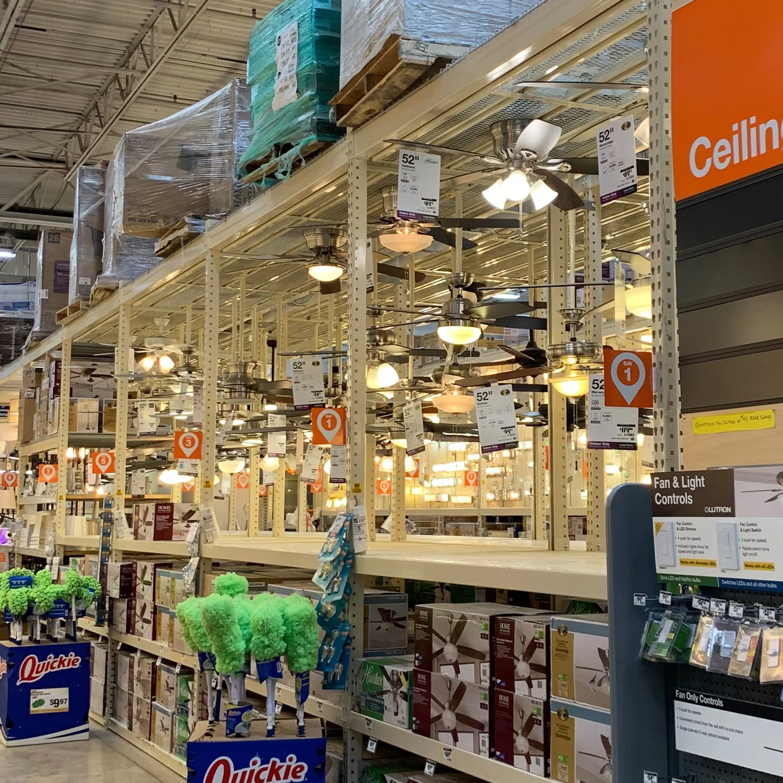
Kichler Lighting set its sights on becoming a national brand at The Home Depot, but the lighting aisle was already crowded and frustrating to navigate for most shoppers. Gaining shelf space meant delivering an in-store experience that could not only outperform national competitors, but also accommodate and meet the needs of two distinct audiences: professional contractors who seek quick access to detailed info and style-conscious homeowners who need extra help and reassurance.
The Solution
Backed by research and strategy, our team designed a best-in-class merchandising system that elevated the entire category. The final design featured product and design-forward vignettes, a dimmable interactive display, QR code integration for interactive graphic messaging, and a refreshed packaging system, all working together to simplify a notoriously frustrating aisle and deliver a more premium brand experience.
Our cross-functional approach helped Kichler not only win the test but establish a lasting presence with an engaging, omni-channel solution.
Client: Kichler Lighting
Location: Nationwide
Size: 8ft Bay
Completion Date: 2020
MY ROLE
Creative Director, Experiential (Display) Design
HIGHLIGHTS
12
Week Timeline
30+
Long-Form Interviews Conducted
6
Focus Groups for Concept Testing
Embracing a spectrum
of possibilities.
The lighting aisle at The Home Depot was cluttered, difficult to shop, and visually overwhelming. We saw an opportunity to lead with a higher-end, easier-to-navigate solution.
Understanding our Audience
The team conducted a multi-stage original research study, including 30 semi-structured interviews of everyday homeowners, luxury purchasers, contractors, and other lighting professionals who had shopped The Home Depot for lighting fixtures in the past year to understand their shopping motivations, pain points, and more. We learned the following:
The Pro audience needs:
Speed
Need to get in/out of the store quickly to get back to the job site in a timely manner.
Clarity
Needs detailed specs to confirm the fixture will work for their job.
Finish-Matching Tools
To identify if it will match their clients’ existing finishes (the Key selection criteria).
The Consumer audience needs:
Guidance
Needs entry level education on how to select a light fixture.
Reassurance
Needs to know if this will supply enough illumination for their room size, and if they have the tools for the job - before leaving the store.
Inspiration
Opportunities to visualize how different fixture styles and finishes would look in their own space.
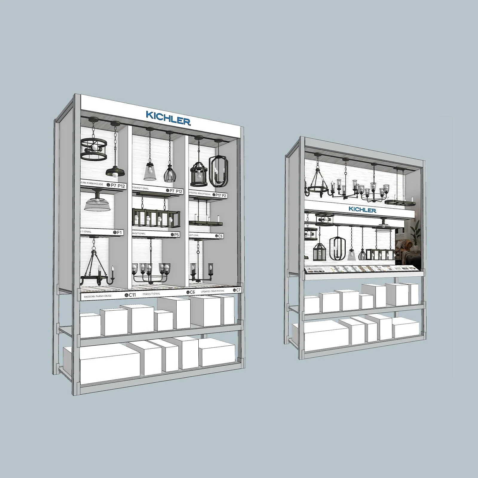
Designing the Experience
Our task was to design a merchandising system that could stand out visually, guide users intuitively, and deliver just the right information, at just the right moment. I focused on building a tactile, interactive in-aisle experience that invited people in and helped them explore confidently.
Narrowing the concepts down to 2, when then conducted 6 focus groups of both audiences for concept testing.
We created a one unified system that served two (very different) types of shoppers.
In order to meet the needs of both audiences and align with each of their shopping behaviors and expectations, we developed a content strategy, a hybrid shopping experience, and a complete redesign (including a new merchandising display design, display graphics, and a new packaging design) to support key decision points throughout each audience’s shopper journey.

It’s all about providing the right information, at the right place, at the right moment.
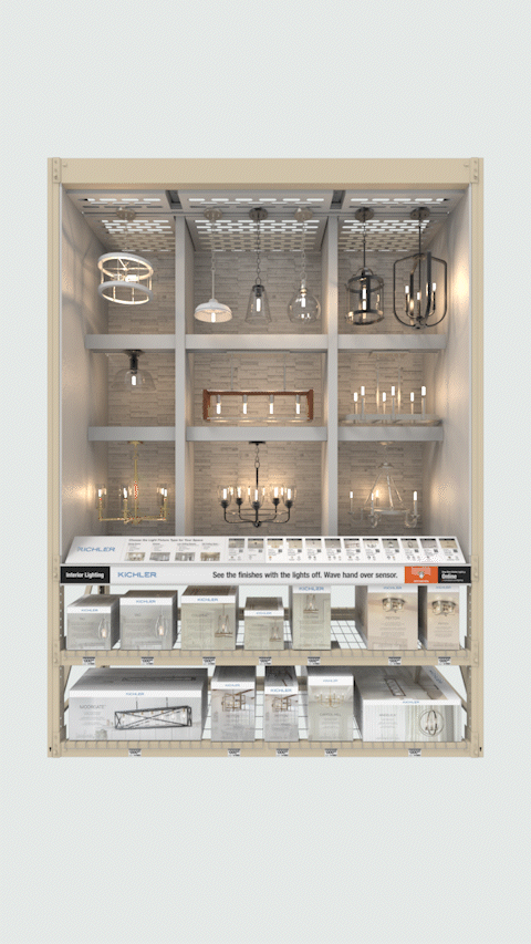
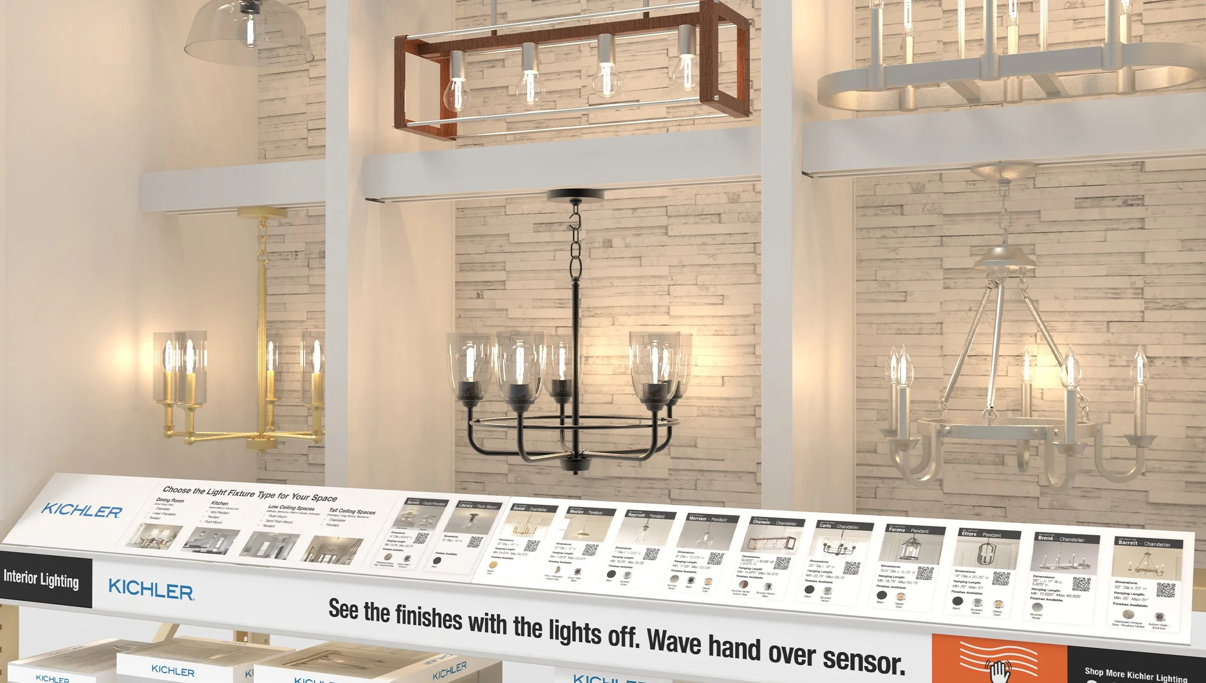
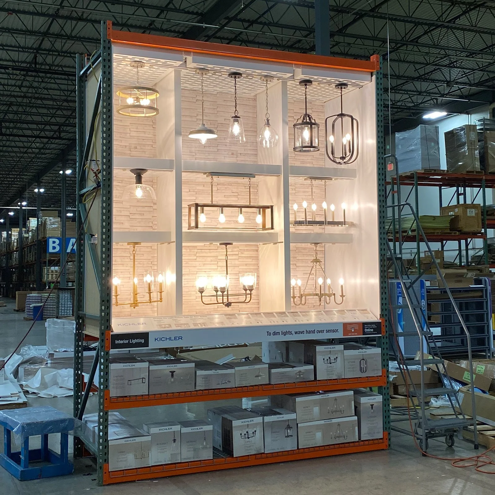
The Final Display
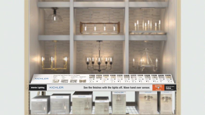
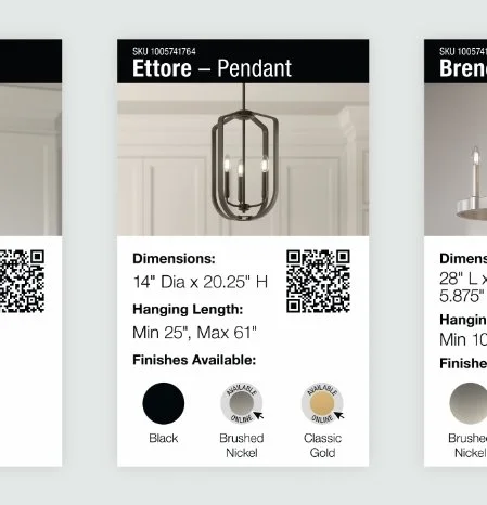
We brought product stories to life with upscale vignettes, layered product storytelling with QR-enabled graphics leading to The Home Depot product webpages, and motion-sensor dimmable lighting system that let shoppers try before they buy.
The final display used clean lines and warm tones to create contrast with the cluttered aisle environment. It was designed to scale nationally, while still feeling personal and brand-authentic.
THE RESULT
Lighting the Way to Retail Success.
Kichler passed its test market and earned national placement in The Home Depot stores across the country. The final experience raised expectations for what an in-aisle category leader could look and feel like.
Project Details
-
Survey & Panel Analysis
Numerator
Research Oversight & Creative Brief
Biran GeeFocus Group Recruiting
Focus ForwardFocus Group Facilitation
Fiona Ray, Ready About
Animations for Focus Group
Nick Salerno, Coldfront FX
Store Audits
Kathleen Carron
Paul Kovacs
Felipe Oropeza -
Creative Strategy
Kathleen Carron
Concept Development
Kathleen Carron
Paul Kovacs
Ken V.
Chanhee
Display Graphics
Kathleen Carron
Kaity BurnsRenderings & Animations
Kathleen Carron
Felipe Oropeza -
Creative Strategy
Brett CaseyDesign
Brett Casey
Kaity Burns -
Fabrication
Niven Marketing